How to Choose Interior Paint Colors: A Designer's Room-by-Room Guide
Choosing paint colors is where most rooms go sideways. This is the process I actually use with clients — how to read undertones, test the way pros test, and land on a color you'll still love five years from now.

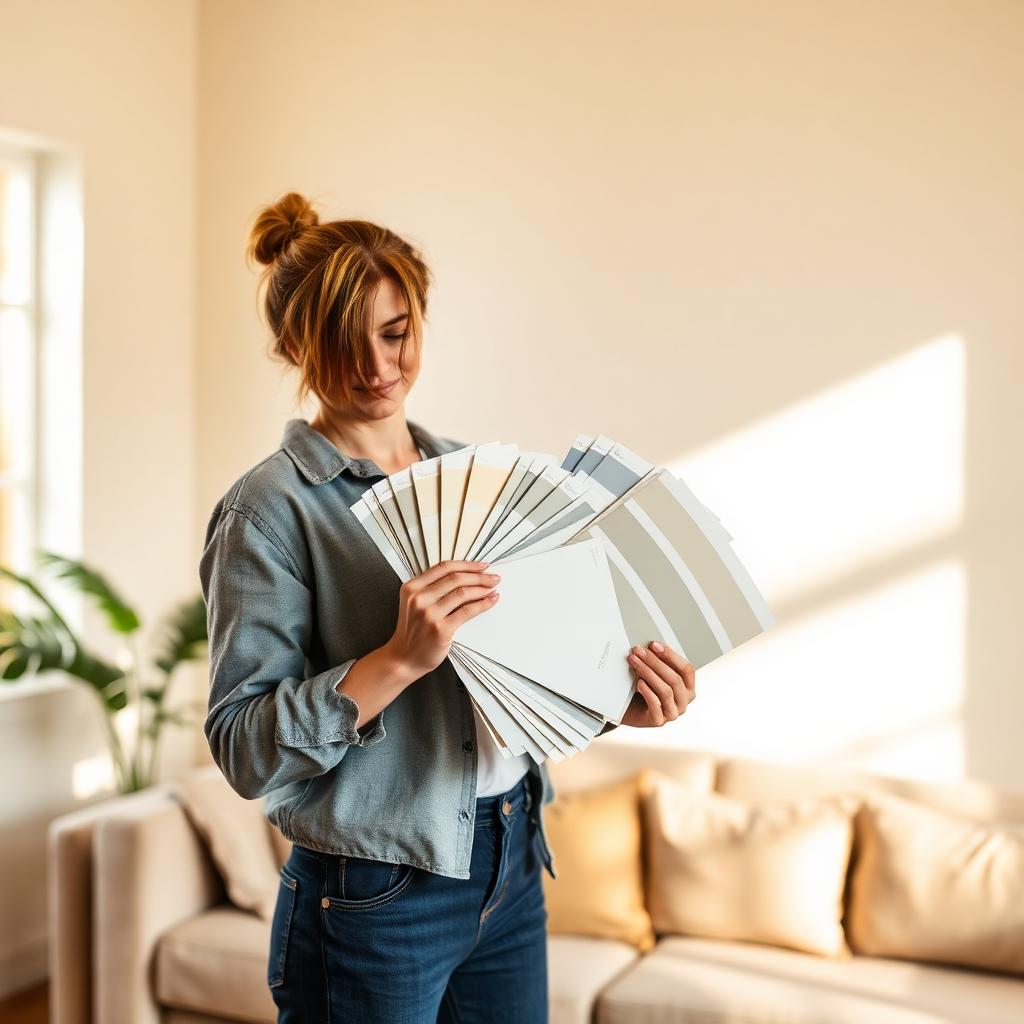
There is no single design decision more people redo than paint color. I've walked into dozens of homes where a room was painted, lived in for two weeks, hated, and repainted — always at a cost of a weekend and a few hundred dollars in wasted paint. It's such an avoidable mistake, and it happens for the same reasons every time: people pick from a two-inch chip in a hardware store, don't test properly, and don't understand undertones.
After fourteen years of specifying paint for residential projects, I've narrowed the process down to something any homeowner can follow. It takes a bit of patience — usually a week from starting to committing — but that patience is what separates a room that feels right the moment you walk in from a room you can never quite settle into. This is the process, room by room, with the specific traps to watch for in each space.
Start with light, not color
The single most important variable in how any paint color reads is the light in the room. A color that looks warm and creamy in a north-facing bedroom will look yellow and greenish in a south-facing living room, even though it's physically the same paint. Before you look at a single swatch, take a day and pay attention to your room's light.
North-facing rooms get cool, indirect light all day. Colors read cooler and grayer than they do on the chip. This is where warm neutrals and colors with warm undertones tend to look best — a pure gray will read as cold and slightly depressing, but a warm greige or a soft off-white will feel calm and light-filled.
South-facing rooms get warm, golden light for most of the day. Colors read warmer and more saturated than they do on the chip. Rich, warmer colors can work here, but pure yellows and warm creams can start to feel intense. Cooler colors — a soft blue-gray, a pale sage — read as balanced rather than cold in a south-facing room.
East-facing rooms get bright warm light in the morning and cool light in the afternoon. West-facing rooms are the opposite: cool in the morning, warm and orangey in the late afternoon. Rooms that shift dramatically through the day need colors chosen with the room's most-used hours in mind. A bedroom used mostly at night should be tested at night.
Learn to read undertones
Every 'neutral' paint color has an undertone — a subtle underlying hue that the eye reads even when it's not obvious on the swatch. A white with a pink undertone looks warm and inviting next to a cool tile; a white with a green undertone looks sickly next to that same tile. Reading undertones is the single skill that turns amateur paint choices into professional ones.
The easiest way to see an undertone is to put a swatch next to a pure white piece of paper. Whatever color the swatch reads as, compared to the white paper, is its undertone. A 'white' paint next to true white paper might suddenly reveal itself as slightly pink, yellow, blue or green. The undertone becomes obvious.
Then look at your room's fixed elements — tile, wood floors, countertops, cabinets, stone fireplace — and identify their undertones the same way. The goal isn't to match; it's to be compatible. A warm undertone in the paint plays well with warm-undertone fixed elements. A cool paint over a warm floor will always feel slightly off, even if you can't name why.
The right way to test a color
Paint sample chips are useful for narrowing down to three or four candidates, but no chip — no matter how big — will tell you what a color looks like on your walls. You have to paint samples on the actual walls, in enough size, and look at them over enough time.
My method: for each candidate color, buy a sample pot and paint a 2-by-2-foot patch directly on two different walls in the room — one on a wall that gets direct light, one on a wall that's mostly in shadow. Do not paint on white paper and tape it up; the surrounding white completely changes how you read the color. Paint two coats and let it dry fully before judging.
Then live with the samples for at least three days. Look at them in morning light, at noon, in the evening, and at night with the lamps you actually use. A color that looks perfect at 2 p.m. in bright afternoon sun can look muddy and depressing at 8 a.m. in November. If you don't like every hour of every day, keep looking.
Living rooms: warm, grounded and forgiving
The living room is where people spend the most conscious hours, so it should feel like a color you enjoy being around — not a color that impresses guests. My default recommendation for most living rooms is a warm off-white or a soft, grounded warm neutral. It sets a calm backdrop that lets furniture, art and textiles do the talking, and it forgives everything from a red sofa to a dusty blue rug.
If you want more character, a soft warm gray-green or a deep muted blue can work beautifully in a living room with good natural light. Both colors have enough saturation to feel intentional but stay quiet enough that you're not constantly aware of the walls. Avoid true beige (dated) and cool gray (cold) in most living rooms.
For a small living room, consider going darker rather than lighter. A saturated matte deep green or a smoky blue on all four walls plus the ceiling reads as intentionally cozy rather than cramped, because the corners disappear visually. The instinct to paint a small room bright white to 'open it up' rarely works.
Kitchens: consider the cabinets before the walls
In a kitchen, the cabinets are the largest color surface in the room by a wide margin — they're what your eye reads first. Choose the cabinet color first, then choose a wall color that supports it. Doing it the other way around is why so many kitchens end up feeling slightly off.
With white or off-white cabinets, wall colors have enormous latitude — warm neutrals, sage greens, soft blues and muted terracottas all work. With colored cabinets (navy, deep green, black), the wall color should usually be quieter — a warm white or soft neutral — so the room doesn't compete with itself.
One kitchen trap: bright white walls next to bright white cabinets almost never look right, because the two whites will have different undertones and clash. Either match the wall color to the cabinet color exactly, or use a distinctly softer, warmer wall tone.
Bedrooms: pick for the way light hits your face
In a bedroom, the wall color is the last thing you see before you close your eyes and the first thing you see when you open them. Test bedroom colors at those times, not at noon. A color that looks pleasant at 6 p.m. can look sickly at 6 a.m. in a shaded bedroom.
For primary bedrooms, I lean toward soft, muted, slightly desaturated colors — warm neutrals, muted sages, dusty blues, warm grays with a hint of lavender. Anything highly saturated becomes tiring to wake up to over months and years, even if it photographs beautifully.
For a bedroom with white or light bedding, a moodier wall color reads as sophisticated and restful. For a bedroom with heavy pattern or bold color in the bedding, a quieter wall lets the bed do its work.
Bathrooms: fixtures win every argument
In a bathroom, the tile, the vanity and the countertop are permanent, and the paint has to serve them. Bring paint chips into the bathroom and hold them right against the tile and countertop before you decide anything. A gorgeous paint color on a swatch can turn the tile you love into a strange muddy color under it.
For most bathrooms with white or neutral tile, a soft warm off-white or a very pale warm neutral is the safe and beautiful choice. It keeps the room light and lets the tile look clean.
For bathrooms with a lot of white tile and no natural light, avoid pure white paint — the whole room can start to feel institutional. A warm off-white with a touch of ivory or greige adds just enough warmth to feel human.
In a powder room with no shower, you can afford to be bold — deep saturated colors, wallpaper, dark green or navy — because you're not spending long stretches in the room. A powder room is where a lot of my clients get to experiment with a color they'd never live with in a bigger room.
Hallways, stairwells and connected spaces
Hallways and stairwells rarely get their own dedicated color. They're transitional spaces, and the color needs to work with every room whose door they open onto. The simplest rule: pick the wall color from your most-used adjacent room and continue it through the hall.
In open-plan homes with a great room that flows into a kitchen and dining area, one wall color throughout the connected space almost always looks better than three coordinating colors. Delineate zones with rugs, lighting and furniture — not paint.
For a large stairwell where the wall runs from the first floor to the ceiling above the second-floor landing, remember that the color reads darker as it goes up (less light reaches the upper reaches). Sample the color on the highest wall as well as the lowest.
Ceilings, trim and the finish that changes everything
Default trim white is almost always the wrong choice. It reads bright and slightly blue against most wall colors and almost every hardwood floor. A warm off-white trim — softer than pure white, with a warm undertone — quietly makes rooms look more considered without anyone knowing why.
For ceilings, the safe move is to match the trim (a soft warm white) or to go one shade lighter than the wall color. A stark white ceiling above a colored wall creates a hard visual line that shortens the room. A ceiling in the same color family softens that line and makes ceilings feel higher.
Paint finish matters as much as color. Flat and matte finishes hide wall imperfections and read as more sophisticated on walls. Eggshell is a fine compromise for spaces that need occasional cleaning. Satin and semi-gloss belong on trim, doors and cabinets — not on modern walls, where they highlight every bump.
How to pick a paint brand and quality that lasts
Not all paint is created equal. A gallon of high-quality paint costs $70 to $90; a gallon of contractor-grade paint costs $30 to $40. That difference sounds significant until you calculate what your time is worth. Good paint covers in two coats where cheap paint needs three, holds color longer, resists scuffs better, and cleans without leaving marks.
The mainstream premium lines from major manufacturers — Benjamin Moore, Sherwin-Williams, Farrow & Ball, and a handful of others — are all genuinely good. Differences between them come down to specific finish quality, the color library, and how well their color-matching stands up over time. Any of them will outperform an economy line by a wide margin.
One tip most people miss: buy all the paint for one project in one order, not in pieces over weeks. Paint batches vary slightly, and the difference between two batches of the 'same' color can be visible on a large wall.
Colors that age well vs colors that date fast
Certain colors show up in every era's design magazines and then vanish. In the early 2000s it was Tuscan orange and sage. In the 2010s it was cool gray on everything. Right now, the risky trend is heavy, aggressive earth tones — burnt umber, mustard, terracotta on entire rooms — which will feel dated within five years if the entire palette turns back toward cooler neutrals.
Colors that consistently age well: warm off-whites, soft warm greiges, muted sages, dusty blues, and true muted neutrals. These have been fashionable, out of fashion and back in fashion three times in my career, and they always look intentional because they don't shout.
The way to enjoy a trendy color without regret is to put it somewhere small and cheap to change: a powder room, an interior door, an accent piece of furniture. Leaning into a color you love in a small dose is fine. Committing to it on every wall of a great room is what causes the eventual repaint.
The final check before you commit
Before you buy gallons, do one last check. Look at your samples in every light condition and next to every major fixed element in the room — floor, trim, cabinets, tile, big pieces of furniture. If any pairing makes you pause, that's the pairing that will bother you every day once the walls are painted.
Ask someone whose taste you trust to look at the samples with fresh eyes. Not to overrule your instinct — you have to live there — but to catch things you've stopped seeing after staring at swatches for a week. A second opinion catches undertone clashes surprisingly often.
When you're finally sure, buy the paint, prep the walls properly, and commit. A well-chosen color, applied cleanly, is one of the most transformative things you can do to a room for under $300. And when you get it right, the room will keep quietly working for you every day for years.
Expert tips
- •Never choose a color from the swatch card alone. Sample pots cost $8 and prevent $400 repainting mistakes.
- •Photograph paint samples with your phone under different lights. The camera sometimes catches undertone problems your eye is filtering out.
- •Prime any wall changing color drastically before painting. A single coat over the wrong undercolor is why paint jobs look patchy.
- •Save a small labeled jar of every paint color you use in your home. Future touch-ups become effortless.
- •In an open-plan space, use one color throughout and vary sheen (matte for walls, eggshell for the kitchen area) rather than switching colors.
Common mistakes to avoid
- ✕Picking a color under fluorescent hardware-store lighting. It bears no resemblance to the light in your home.
- ✕Painting a small sample on the wall and judging without letting it fully dry. Wet paint reads a shade darker.
- ✕Choosing pure white trim by default. A soft warm white almost always looks better with modern wall colors.
- ✕Using semi-gloss on walls to 'make cleaning easier'. Every wall imperfection shows and the room feels commercial.
- ✕Trusting a photo on Instagram. Cameras, filters and monitors distort color beyond recognition — a color that looks perfect online can look completely wrong in your home.
Frequently asked questions
Sources & further reading
- Benjamin Moore color and lighting guides — Benjamin Moore
- Sherwin-Williams color visualizer research — Sherwin-Williams
- NCIDQ Interior Design Body of Knowledge — CIDQ
Editor's note: Sarah is NCIDQ-certified and has specified paint for hundreds of residential projects across the U.S. — the process here is the one she uses in her own client work.
Fourteen years designing residential interiors on both coasts, with a soft spot for warm minimalism and small-space layouts.
More in Interior Design
Home Office Setup Guide: A Room You Can Actually Work In
A designer's guide to setting up a home office that supports real work — long past the honeymoon week.
Modern Bedroom Design Trends Worth Paying Attention To
Modern bedroom design trends worth the investment — and the ones I'm already seeing my clients regret.
Small Living Room Design Ideas That Actually Feel Bigger
Real design moves that make a small living room feel bigger without knocking down a single wall — starting with the one mistake almost everyone makes.
Related topics
Ideas from nearby corners of the site you'll probably like too.
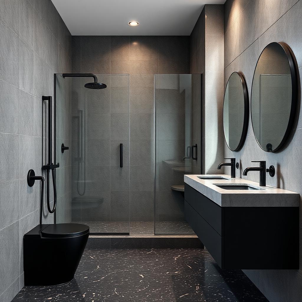
Bathroom Remodeling Ideas That Look Great and Age Well
Bathroom remodeling ideas that still look right ten years in — from layout to finish choices, without the trend regrets.
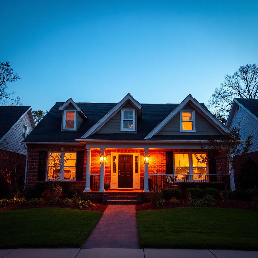
Budget-Friendly Home Renovation Tips From a Contractor
Where to spend, where to save, and the planning steps that keep small renovation budgets from spiraling out of control.
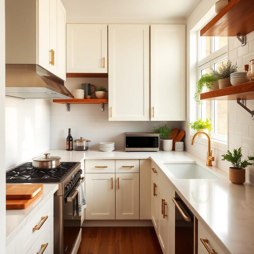
How to Organize a Small Kitchen So It Stays That Way
Zone-by-zone organization for a small kitchen — the storage that pulls its weight and the habits that keep it tidy after week one.